My Plan
For this shoot I want to take photos of the mountains and try to alter the sky area in different ways
Grading: A plan for the shoot is included and detailed
My Photo Shoot
So for this shoot I went up to the La Plata mountains twice over the weekend to shoot photos. I got to take photos with only a little snow on them and then with a lot of snow on them. I was really wanted to have the sky area be completly blue but I ended up getting some planes and clouds in there. I tried different distances, trying to get a lot of options for combining later. I think I like the ones with one distinctive mountain bumb the most.
Grading: 20+ NEW raw photos are included that match the plan and information about the shoot is discussed in several complete sentences
My Edits
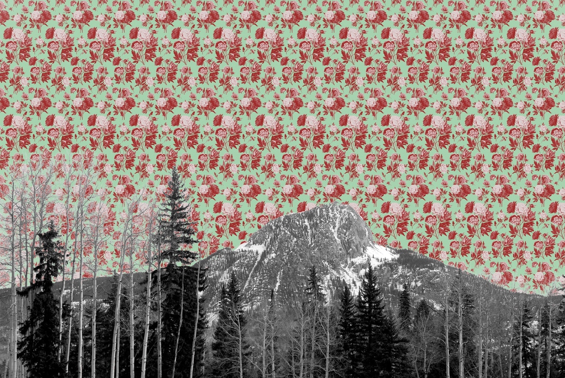
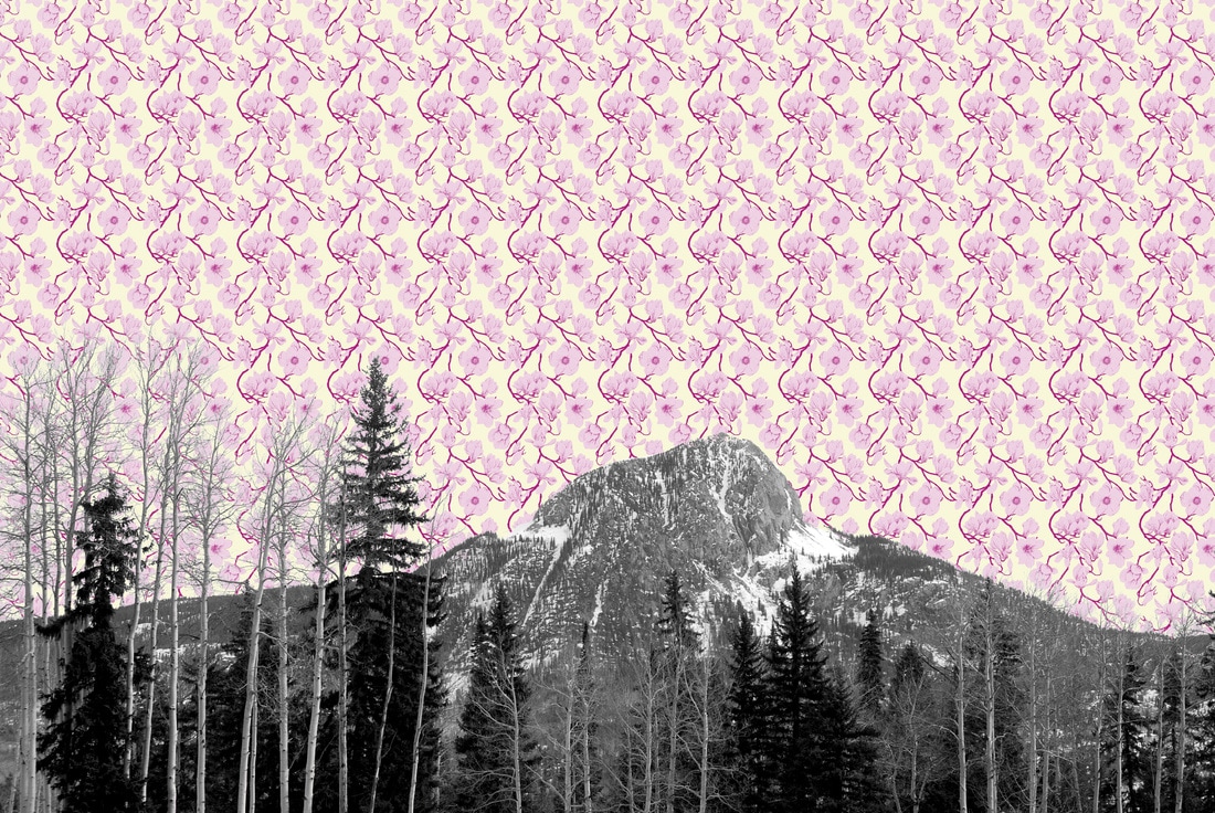
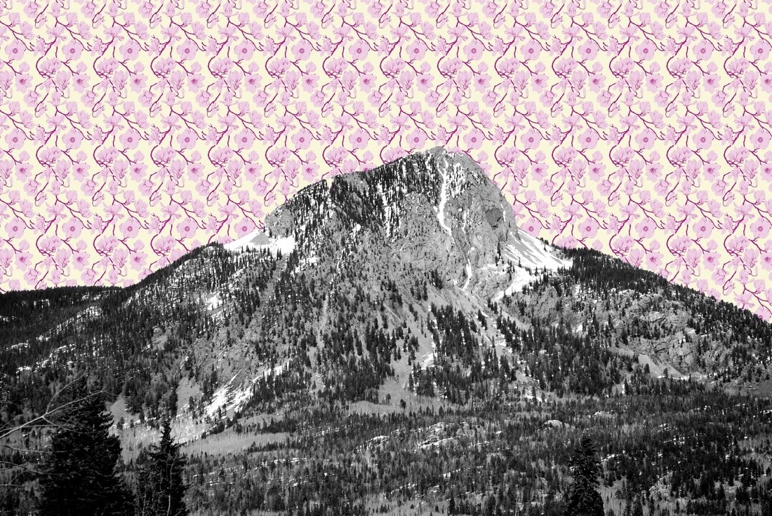

Here are some of my edited photos for this project. I got some patterns off the Internet that I thought looked like old lady wallpaper. I tried putting the different patterns in the sky. I decided to put the mountains in black-and-white to contrast against the colored pattern. I had trouble dropping in the pattern and getting the trees to look clear. Since I was having trouble, I tried some of the closer in mountain without trees and I think they turned out better. I also turned up the contrast to make the the contours of the mountain area really pop out. I also had the idea to try editing in maps while I was working. I was really excited I came up with this idea while editing because the map one turned out really cool.
Grading: A few of the photos are edited for the idea and the thinking about this editing is discussed in several complete sentences
My Printed Photo
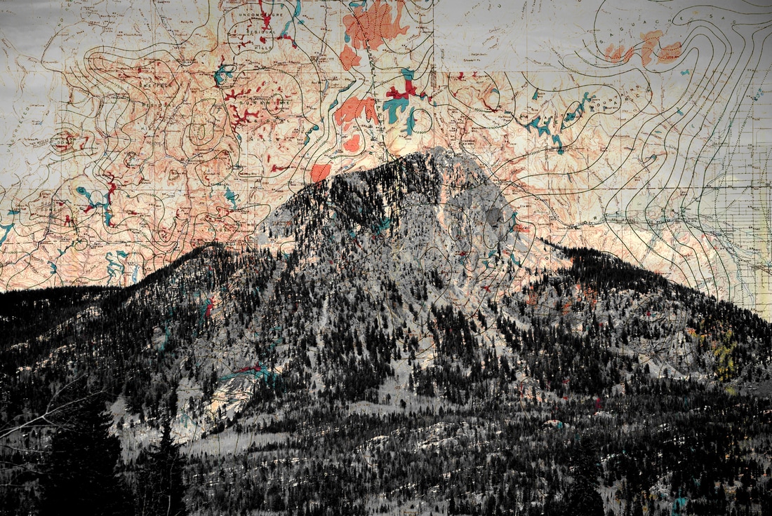
This is the digital photo I ultimately printed from this project of Spud Mountain. I got frustrated with the patterns and thought I would try overlaying maps with the mountains and I really like how this one came out! It is a glacier map that is in the public domain. It is of the glaciers that were in the same valley as this mountain. I used layer blending modes to mix the map layer and the mountain layer together. I really like how the lines from the map mixed with the details of the trees and features of the mountain and create unity in the piece. I used a layer blending mode that mixed these well so that the color is sprinkled throughout the piece. I also like how the space in the piece creates strong contrast between the dark values in the mountain and the light values in the sky. I feel like there is an energy with the pattern of the map coming off of the mountain. I think that this combination makes the viewer think about the history of mountains and the area and gives them a feeling of their mightiness. I also like the color palette of this image and how the colors are all subdued. I think these subdued colors create nice contrast against the black-and-white areas of the mountain. I think this makes the viewer contemplate the idea of man vs. nature. Overall, I think this piece is successful for my goal of putting different things in the sky because the map in the sky works well with the content of the mountain subject-wise and aesthetically. If I did something different, I would have found a glacier map with more lines in the upper right hand corner, the emptiness in this area makes the composition seem a bit unbalanced to me.
Grading: The final photo is displayed (either just the photo or the printed/matted piece) and a discussion of the work is present that references all the steps in 5 Step Critique (OBSERVE, DESCRIBE, ANALYZE, INTERPRET, EVALUATE) in a long paragraph. Pretend you are an art critique who was tasked with critiquing this piece for the newspaper. I want to hear your VOICE come through in your writing.
